Posted on March 2, 2022
Our sensational March Top Doc, MAU, invites audiences to wander into the weird and wonderful world of Creative Design Genius™ Bruce Mau. This distinguished Canadian artist understands better than anyone that excellence is expressed in everything you do, that even the most millimetric details can make or break a design.
Starting as a mere listing of titles and showtimes, the movie poster has now evolved into one of the most important design elements of a film. Though sometimes under-appreciated, great posters have the ability to intrigue, inspire and convince; persuading us to take a chance on films we would've never chosen on the title alone. Simply put, a well-designed poster allows us to interpret films in an entirely different way.
Our cinematically seasoned CIFF staff have put together a selection of their favourite movie posters that prove they are so much more than the wall art of choice for every dorm room in the Americas.
Brian Owens, Artistic Director
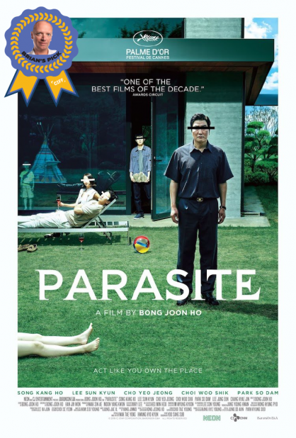
PARASITE (2019)
PARASITE's poster manages to reveal its themes of class and identity without revealing any of the twists and surprises of the plot. The colourful beach ball in the center draws your eyes as it contrasts the earth tones that dominate the poster and the legs in the foreground let you know something is going to go terribly wrong in this movie. And that teaser: "Act like you own the place" is a masterstroke. When you look back on what a massive hit this became, you realize that this poster was the perfect compliment to the word-of-mouth buzz the film was creating. It pulls you in with its sense of mystery. It demands that you see the film.
Adam Keresztes, Shorts Programmer
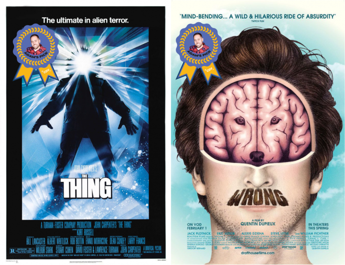
THE THING (1982) & WRONG (2012)
THE THING poster is a bit obtuse in terms of providing details regarding the movie. But, once you've seen the film, the poster makes a lot more sense. It also happens to be one of my favourite movies.
I like that the WRONG poster is absolutely literal. I mean, the man has his dog on his mind. It's also exactly the kind of absurd and surreal image that we've come to expect from a Quentin Dupieux film.
Morgan Cairns, Marketing Manager
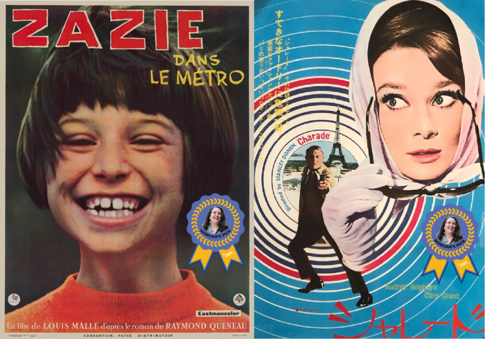
ZAZIE DANS LE METRO(1960) & CHARADE (1963)
I adore movie posters, so narrowing it down to just one was tough. But going with my gut, I think it has to be the poster for Louis Malle's ZAZIE DANS LE METRO. It's an incredibly simple poster, a young girl smiling a big baby-teethed grin, but every time I look at it, it just warms my heart. It's the perfect portrayal of the innocence and carefree joy of childhood. Plus, there's something so charmingly French Nouveau about it that makes me long for 1960s Paris.
I lied; I couldn't pick just one. The Japanese poster of CHARADE is another movie poster that just blows my socks off. The sky blue background paired with the bullseye-like circles are already amazing, but add a gun-wielding Gary Grant and Audrey Hepburn throwing you the side-eye and you have perfection.
Lucia Juliao, Partnerships & Donations Manager
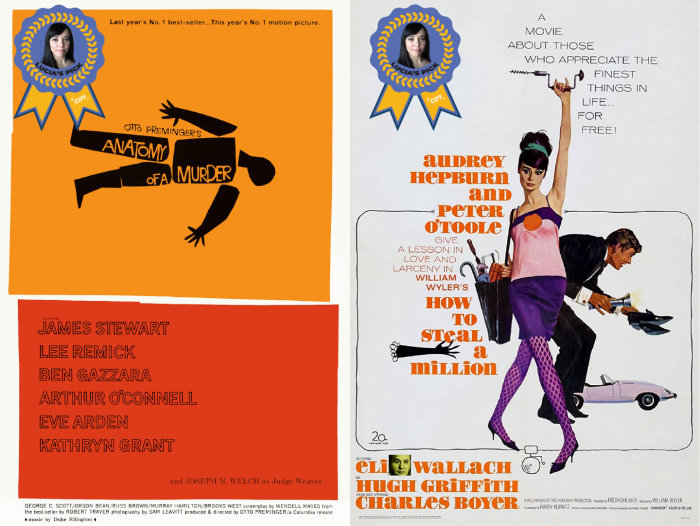
ANATOMY OF A MURDER (1959) & HOW TO STEAL A MILLION (1966)
I definitely had to choose a Saul Bass design. His name is nearly synonymous with movie posters and ANATOMY OF A MURDER is one of my favourites of his.
As a second choice, I knew I had to go with an Audrey Hepburn movie and I absolutely love the aesthetic of the HOW TO STEAL A MILLION poster. The fashion, the font, the pose...the whole look is fantastic!
Gaby Aguilar, Marketing Content Coordinator
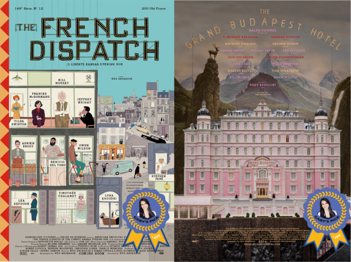
The french dispatch (2021) & the grand budapest hotel (2014)
In a world full of posters using and abusing the "celebrity pyramid" structure in all of their designs, I am always delighted to see a mainstream movie poster from Wes Anderson. His films are known for their iconic use of colour and the quirkiness of their characters; it is only fitting that his movie posters be just as colourful and quirky. It is really refreshing to see a real, hand-drawn illustration, something about them feels more authentic.
THE FRENCH DISPATCH poster particularly caught my eye this past year with its use of levels, compartments and its shaky, children's-book-like art style. As for THE GRAND BUDAPEST HOTEL, you can add me to the very extensive list of people who love this movie. This poster makes great use of atmospheric perspective to create a real depth, pulling the viewer in. The size and vibrance of the hotel make it look almost alive, letting the viewer know that this was once a magical place.
